Molenaartje
Standing out in health food stores
Molenaartje has long been a favorite organic snack in the Dutch and export markets, but sales were declining. So Royal Wessanen asked us to investigate the brand and create a great story that would help build Molenaartje’s position in the market – and inspire a new packaging design.

Tasting, questioning and interviews
We needed to discover why their market share was falling. So we began by visiting health food stores – and analyzing the competition, packaging designs and messaging. Brandframe also carried out:
- In-depth investigation & tasting
- Researching the ingredients
- Interviews with food experts
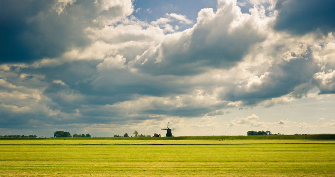
To build a sense of heritage, we turned to the world of grains and milling (Molenaartje means “little miller” in Dutch). After exploring Molenaartje’s core values, we redefined the brand positioning and worked on:
- Sharpening the existing brand key
- Brand personality and persona
- Mood board with new art direction
- Strategic brand story with tone of voice
From positioning to packaging
This made it easy for everyone at Royal Wessanen to easily understand, feel and remember the new brand positioning and how to speak to the new target audience. We also delivered:
- Straplines
- Pack hierarchy and language
- Briefing for a total redesign of the packaging and logo
Because of deep knowledge of the brand, and our experience in creative direction and design, we also supervised the entire design process, as we acted on behalf of our client.
By keeping an eye on the texts used on the packaging, we were able to take the brand story onto the pack in health food stores. The results: Molenaartje has a unique personality that complements its brand and brand values. And their products are once again popular at shops – and in the hearts of more and more consumers.